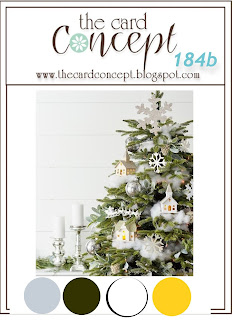
Welcome to another inspiration challenge with The Card Concept and as it's our second challenge of the month, we have two beautiful images to give you a choice for your creativity.
I picked option (b), taking the house/church ornaments and baubles as my inspiration and also using the colour palette.
The village buildings were all cut from watercolour paper and hand coloured with dye inks and an aquabrush. The (bauble) sky and trees are also watercolour paper, coloured using oxide sprays before die-cutting. For the background I stamped with Versamark and clear embossed, then ran a white ink pad over the whole thing to give a more distressed look. It also helps the clear embossing stand out more. Excess ink was wiped off then I sewed around and lightly distressed the edges. White calligraphy ink was splattered very liberally for a snowy effect. The bauble is raised, as are some of the buildings.
Materials used:
- stamps - Christmas background (MFT)
- card - basic white, smoky slate, basic grey, watercolour, soft succulent
- SU inks - smoky slate, basic grey, daffodil delight
- distress oxide sprays - speckled egg, tumbled glass, rustic wilderness, mowed lawn, forest moss
- dies - Snowglobe 2 (Tim Holtz), Christmas bauble, Treeline (Tim Holtz)
- other - Big Shot, craft foam, aquabrush, paintbrush, Kuretake white calligraphy ink, MISTI, picket fence distress ink, clear embossing powder, heat tool, Dimensionals, silver ribbons, distressing tool


Wow, what an impressive card. Absolutely gorgeous. You have such a knack with colour and design. TFS
ReplyDelete